Pie-chart
A pie graph (or pie chart) is a specialized graph used in statistics. The independent variable is plotted around a circle in either a clockwise direction or a counterclockwise direction.The dependent variable (usually a Percentage) is rendered as an arc whose measure is proportional to the magnitude of the quantity.Each arc is depicted by constructing radial lines from its ends to the center of the circle, creating a wedge-shaped “slice.”The independent variable can attain a finite number of discrete values (for example, five).The dependent variable can attain any value from zero to 100 percent.
The illustration is a pie graph depicting the results of a final exam given to a hypothetical class of students.Each grade is denoted by a “slice.”The total of the percentages is equal to 100 (this is important; if it were not, the accuracy of the graph would be suspect).The total of the arc measures is equal to 360 degrees.
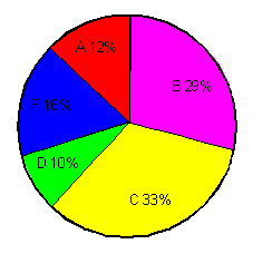
From this graph, one might gather that the professor for this course was not especially lenient nor severe.It is evident that grading was not done on a “pure curve” (in which case all the arcs would have equal measures of 72 degrees, corresponding to 20%).If this graph were compared with those of classes from other years that received the same test from the same professor, some conclusions might be drawn about intelligence changes among students over the years.If this graph were compared with those of other classes in the same semester who had received the same final exam but who had taken the course from different professors, one might draw conclusions about the relative competence and/or grading whims of the professors.
Example
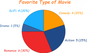
Imagine you survey your friends to find the kind of movie they like best:
| Table: Favourite Type of Movie | ||||
| Comedy | Action | Romance | Drama | SciFi |
| 4 | 5 | 6 | 1 | 4 |
Pie chart representation of above table
 ,
,
A pie chart is a circular statistical graphic, which is divided into slices to illustrate numerical proportion. In a pie chart, the arc length of each slice is proportional to the quantity it represents. While it is named for its resemblance to a pie which has been sliced, there are variations on the way it can be presented.
Pie charts are often used to compare the relative sizes of different categories. For example, a pie chart might show the percentage of people in a country who identify with different religions. Or, it might show the percentage of a company’s revenue that comes from different product lines.
Pie charts can be a helpful way to visualize data, but they can also be misleading. For example, if a pie chart shows that 50% of people in a country identify as Christian, it might seem like there is a large gap between Christians and people who identify with other religions. However, if the country has a Population of 100 million people, then there are actually 50 million Christians and 50 million people who identify with other religions. In other words, the pie chart doesn’t show the actual number of people in each category, just the percentage.
Another potential problem with pie charts is that they can be difficult to compare. If a pie chart shows the percentage of people in a country who identify with different religions, it can be difficult to see how the percentages compare to each other. For example, if the chart shows that 50% of people identify as Christian, 25% identify as Muslim, and 25% identify as Hindu, it can be difficult to see whether the difference between Christians and Muslims is larger or smaller than the difference between Muslims and Hindus.
Despite these potential problems, pie charts can be a helpful way to visualize data. They are easy to understand and can be used to compare the relative sizes of different categories. However, it is important to be aware of the limitations of pie charts and to use them carefully.
Here are some tips for using pie charts effectively:
- Use pie charts to compare the relative sizes of different categories.
- Don’t use pie charts to show the actual number of people in each category.
- Use a key or legend to identify the different categories.
- Make sure the pie chart is easy to read and understand.
- Avoid using pie charts for complex data sets.
- Use other types of graphs, such as bar graphs or line graphs, to show more complex data.
What is a pie chart?
A pie chart is a circular statistical graphic, which is divided into slices to illustrate numerical proportion. In a pie chart, the arc length of each slice is proportional to the quantity it represents. While it is named for its resemblance to a pie which has been sliced, there are variations on the way it can be presented.
What are the advantages of using a pie chart?
Pie charts are easy to understand and can be used to compare data quickly. They are also relatively simple to create. However, pie charts can be difficult to read if there are many slices, and they can be misleading if the data is not evenly distributed.
What are the disadvantages of using a pie chart?
Pie charts can be difficult to read if there are many slices. They can also be misleading if the data is not evenly distributed. Additionally, pie charts can be difficult to compare if the slices are not of equal size.
How do you create a pie chart?
To create a pie chart, you will need to gather your data and then create a spreadsheet. In the spreadsheet, you will need to create a column for each category of data and a column for the value of each category. Once you have created your spreadsheet, you can use a pie chart function to create your chart.
How do you interpret a pie chart?
To interpret a pie chart, you will need to look at the size of each slice. The size of each slice represents the percentage of the total that is represented by that category. For example, if a pie chart has four slices, and one slice is twice as big as the other three slices, then the category represented by that slice is twice as large as the other three categories combined.
What are some common mistakes to avoid when using pie charts?
Some common mistakes to avoid when using pie charts include:
- Using too many slices. A pie chart with too many slices can be difficult to read and interpret.
- Not evenly distributing the data. If the data is not evenly distributed, the pie chart can be misleading.
- Using pie charts to compare data that is not evenly distributed. If the data is not evenly distributed, a pie chart can be misleading.
- Using pie charts to compare data that is not categorical. Pie charts are best used to compare categorical data.
What are some alternative ways to visualize data?
Some alternative ways to visualize data include:
- Bar charts
- Line graphs
- Area charts
- Scatter plots
- Heatmaps
- Treemaps
- Sankey diagrams
Which type of visualization is best for a particular dataset?
The best type of visualization for a particular dataset depends on the type of data and the purpose of the visualization. For example, bar charts are often used to compare categorical data, while line graphs are often used to track changes over time.
A pie chart is a circular statistical graphic, which is divided into slices to illustrate numerical proportion. In a pie chart, the arc length of each slice is proportional to the quantity it represents. The pie chart is one of the simplest ways to represent a single variable.
A bar graph is a chart or graph that presents categorical data with rectangular bars with heights or lengths proportional to the values that they represent. The bars can be plotted vertically or horizontally. A bar graph is a simple way to compare the values of different categories.
A line graph is a graph that displays information as a series of data points connected by straight line segments. Line graphs are often used to show trends over time.
A scatter plot is a type of mathematical diagram using Cartesian coordinates to display values for two variables for a set of data. The data is displayed as a collection of points, each having the value of one variable determining the position on the horizontal axis and the value of the other variable determining the position on the vertical axis.
A histogram is a graphical representation of the distribution of data. It is an estimate of the Probability distribution of a continuous variable (quantitative variable) and was first introduced by Karl Pearson. A histogram is an estimate of the probability distribution of a continuous variable (quantitative variable) and was first introduced by Karl Pearson.
A box plot or box-and-whisker plot is a standardized way of displaying the distribution of numerical data. It shows the five number summary: the smallest observation (sample minimum), lower quartile (Q1), Median (Q2), upper quartile (Q3), and largest observation (sample maximum). A box plot can also be drawn with additional lines showing the median of the upper and lower halves of the data, the inter-quartile range (IQR), and the whiskers extending from the box to the minimum and maximum data points.
A stem-and-leaf plot is a way of organizing data that is similar to a histogram, but it takes up less space. To create a stem-and-leaf plot, you first divide the data into groups of tens, hundreds, and so on. Then, you write each data point as a stem (the tens and hundreds digits) and a leaf (the ones digit). For example, the data point 34 would be written as 34. You then arrange the data points in order from smallest to largest, and draw a vertical line between each group of tens, hundreds, and so on. The leaves for each data point are then written below the vertical line, in order from smallest to largest.
A Pareto chart is a type of bar graph that illustrates the distribution of values within a data set. The bars in a Pareto chart are arranged in descending order, with the bar with the highest value on the left and the bar with the lowest value on the right. The Pareto principle, also known as the 80/20 rule, states that 80% of the effects come from 20% of the causes. A Pareto chart can be used to identify the most important causes of a problem, so that you can focus your efforts on solving them.
A scatter plot matrix is a way of displaying the relationship between two variables for multiple groups of data. To create a scatter plot matrix, you first create a scatter plot for each group of data. Then, you arrange the scatter plots in a matrix, with each row representing a different group of data and each column representing a different variable. The scatter plots in a scatter plot matrix can be used to identify patterns in the data and to compare the relationships between variables across different groups.
A heat map is a graphical representation of data where the values are represented by colors. The colors are usually arranged in a spectrum, with darker colors representing lower values and lighter colors representing higher values. Heat maps can be used to visualize data that is difficult to see in a table or chart. For example, a heat map can be used to visualize the distribution of income in a city.